
At its heart, responsive web design is about creating one website that works beautifully everywhere. It’s a smart, flexible approach that automatically adjusts your site’s layout to fit any screen, from a huge desktop monitor right down to a tiny smartphone.
The goal is simple: give every single visitor a fantastic, seamless experience, no matter what device they’re using.
Why Your Website Needs to Impress on Every Screen
Think about how people actually browse the internet these days. They might catch up on your blog during their morning commute on a phone, switch to a desktop computer at the office, and then kick back with a tablet on the couch in the evening.
This multi-device journey is the new normal, and a traditional, fixed-width website just can't keep up. It’s like trying to fit a square peg in a round hole—it creates a clunky, frustrating experience. This is where responsive design becomes more than just a neat feature; it's a fundamental requirement for any modern business.
Without it, you’re forcing a huge chunk of your audience to pinch, zoom, and scroll endlessly just to read your content. Most won't bother.
The Modern User is a Multi-Device User
The stats back this up loud and clear. Here in Australia, the way people get online has completely changed. In 2023, personal computers made up just over half of all internet use, with mobile devices gobbling up the rest.
That means more than 40% of Australians are browsing on smartphones and tablets, a number that’s only heading in one direction. You can get a deeper look into these local usage trends right here at moo.com.au.
A non-responsive site on a small screen leads to sky-high bounce rates and lost customers. If someone can’t easily find what they’re looking for on their phone, you can bet they won’t be coming back on their desktop later.
A great user experience is no longer device-specific. It must be consistent, intuitive, and accessible everywhere a customer chooses to engage with your brand. Responsive design is the bridge that makes this universal experience possible.
Ultimately, building a responsive website is about meeting your audience where they are. It ensures your site is a reliable, professional, and user-friendly asset that performs flawlessly across every single device your customers use, every single day.
Understanding the Three Pillars of Responsive Design
To really get what makes responsive design tick, we need to go beyond the buzzwords and look at the three core components that do all the heavy lifting. Think of them as the fundamental rules that allow one website to look fantastic on a tiny phone screen, a tablet, and a massive desktop monitor.
These three pillars work together to ensure a website can gracefully adapt its layout, content, and features to whatever screen it’s being viewed on.
This infographic breaks down how a single responsive design delivers a consistent, optimised experience across different devices.
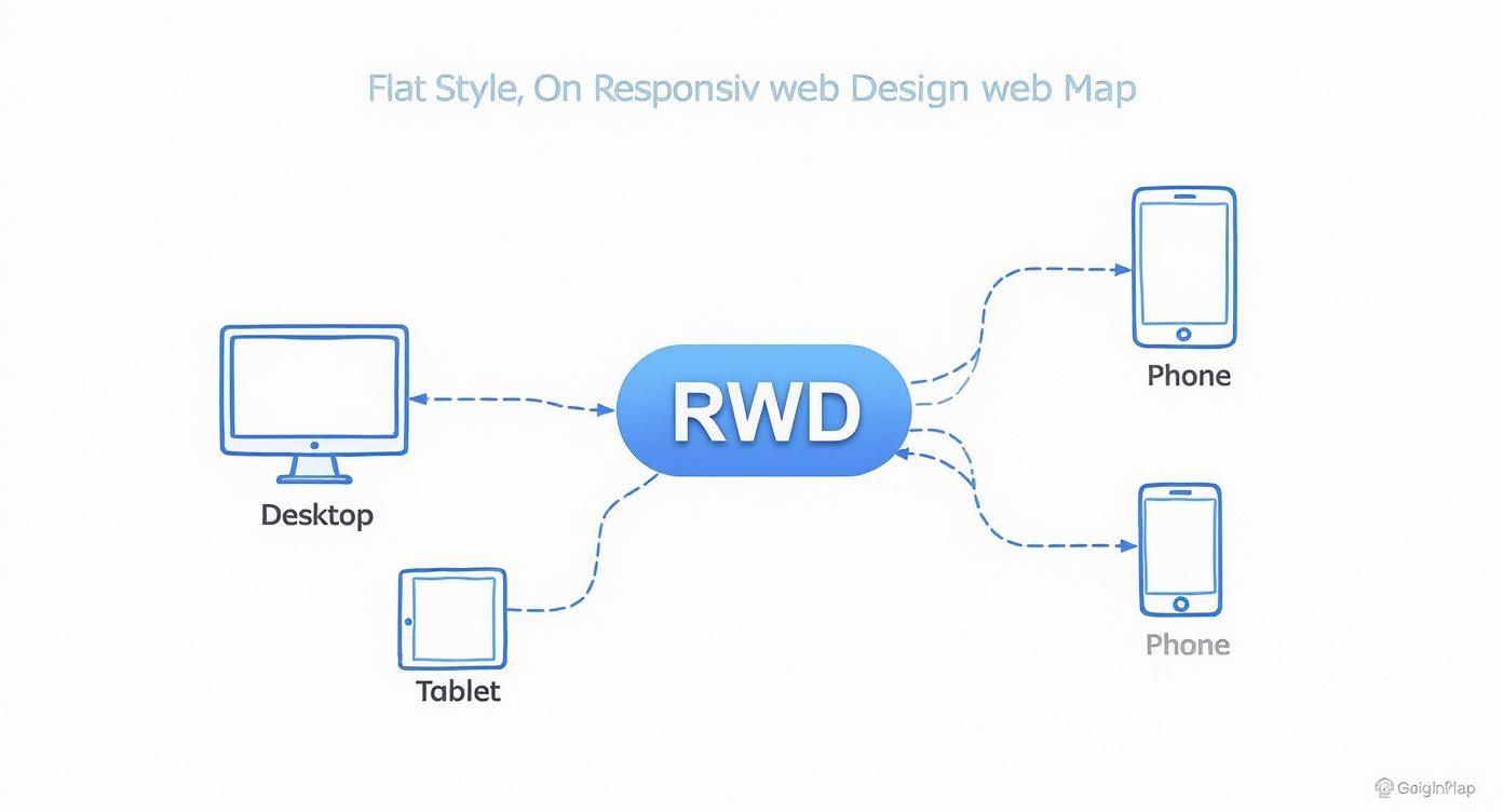
As you can see, the design branches out, serving up the best possible version for every major device category—from desktops and tablets right down to phones.
Pillar One: Fluid Grids
Imagine trying to build a house with walls that are all a fixed, unchangeable length. It would only ever fit perfectly on one specific plot of land. That’s how old, static websites were built. Fluid grids are the complete opposite; they’re like building with flexible, stretchable materials.
Instead of defining website elements with rigid pixel widths (like saying a sidebar must be exactly 300 pixels wide), a fluid grid uses relative units like percentages. So, that same sidebar might be defined as 30% of the screen's total width.
This simple shift changes everything. On a wide desktop screen, 30% might work out to be 400 pixels, but on a narrow smartphone, it could shrink down to just 120 pixels. The element scales in proportion, keeping the layout intact without breaking or forcing that awful horizontal scrollbar. It’s the foundational blueprint for a truly adaptable website.
Pillar Two: Flexible Images and Media
Okay, so a fluid grid fixes the layout problem, but what about the stuff inside it? If you put a big, fixed-size image inside a flexible container, it’s going to spill out and break the whole design on a smaller screen. This is where flexible images come to the rescue.
By applying some straightforward CSS rules, we can tell images and other media (like videos) to never get wider than the container they're in. A common trick is to simply set an image's maximum width to 100%.
This makes sure that as the container shrinks, the image smoothly scales down right along with it, always fitting perfectly in the space available. It stops your visuals from getting distorted or cut off, keeping them looking sharp on any device.
Pillar Three: Media Queries
If fluid grids are the flexible blueprint and flexible images are the adaptable contents, then media queries are the smart supervisors directing the entire show. They are the real magic behind responsive design.
Media queries are simple filters in your website's code that check for specific things about the device, most often the width of the screen. Depending on what they find, they apply a different set of style rules.
In simple terms, a media query asks the browser, "Hey, how wide is your screen?" and then serves up a specific set of instructions based on the answer. This is what allows for those targeted tweaks that make a site feel custom-built for your device.
For example, we can set up a media query to kick in once a screen gets narrower than 768 pixels (a common tablet width). When it does, the code can command the layout to switch from three columns to two, make the font sizes bigger for easier reading, or change a wide navigation menu into a neat, space-saving "hamburger" icon. It's this intelligent, targeted control that makes a responsive site feel so natural to use.
Why Responsive Design Is A Business Non-Negotiable
Let’s be clear: responsive design isn't just a technical box to tick. It’s a core business strategy. Having a website that works flawlessly on every single device is no longer a luxury; it’s a fundamental requirement for growth, visibility, and credibility in today's market. A poor mobile experience is a direct path to lost revenue and a brand reputation you can’t easily fix.
The reason is simple: Google now runs on "mobile-first indexing". This means the search engine primarily looks at the mobile version of your website to decide how to rank it. If your site is clunky, slow, or completely broken on a phone, your search rankings will suffer everywhere, not just on mobile.

Boost Your Search Rankings And User Engagement
A responsive website has a direct and powerful impact on the key metrics that search engines care about. When someone lands on a mobile-friendly site, they’re far more likely to stick around, explore, and eventually become a customer. This positive behaviour sends a strong signal to Google that your site offers a quality experience.
This translates into tangible improvements you can actually measure:
- Reduced Bounce Rates: Visitors won't take one look and leave in frustration.
- Increased Dwell Time: People will spend more time actually reading your content.
- Higher Conversion Rates: A smooth, easy-to-use site makes it simpler for people to buy, sign up, or get in touch.
These factors combine to create a powerful signal that can give your search engine visibility a significant boost. If your business depends on local customers, our guide on SEO services on the Sunshine Coast and Noosa explains just how critical a solid technical foundation, including responsiveness, is for attracting people nearby.
Streamline Costs And Enhance Brand Consistency
From a purely financial standpoint, responsive design is simply the most efficient way to operate. Maintaining one single website that works everywhere is significantly cheaper and less of a headache than trying to manage separate desktop and mobile versions. This consolidated approach saves you real money on development, ongoing maintenance, and content updates.
More importantly, it guarantees a consistent brand experience for every single user. For businesses aiming to create a seamless journey for their customers, responsive design is a key piece of the puzzle in Mastering the Omnichannel Customer Experience. Your brand's look, feel, and message stay the same, strengthening recognition and trust, no matter how a customer chooses to find you.
The Real-World Payoffs of Going Responsive
Thinking of responsive design as just a way to make your website look okay on a phone is missing the bigger picture. It’s a strategic decision that delivers real, measurable growth. The benefits go far beyond just looking good; they directly impact your sales, brand reputation, and how efficiently you can run your online operations.
When you create a seamless, intuitive experience for someone, no matter what device they’re on, you immediately make them happier. A visitor who can effortlessly browse your services or buy a product on their mobile is far more likely to become a customer than someone forced to pinch, zoom, and fight with a clunky desktop layout. It’s all about removing friction.
Boost Your SEO and Get Found More Easily
One of the biggest wins is the massive leg-up it gives your search engine optimisation (SEO). Instead of splitting your authority between a desktop site (www.yourbusiness.com.au) and a separate mobile one (m.yourbusiness.com.au), a single responsive URL consolidates all your SEO muscle.
Every backlink, social share, and mention points to one authoritative domain, which seriously strengthens your ranking potential. This unified approach is exactly what search engines like Google want to see. It makes your site far easier for them to crawl, index, and ultimately, rank higher. Site speed, a huge ranking factor, also gets a major boost. You can see how caching plugins make a difference in our detailed WP Rocket review for Australian websites.
Get Clearer Analytics and Business Insights
Trying to manage separate desktop and mobile sites also means juggling two sets of analytics data, which can be a complete nightmare. A responsive site simplifies this dramatically. With just one website, you get a single, unified data source in tools like Google Analytics.
This makes it incredibly easy to track how people move through your site and understand their behaviour across all devices. You can see the full story: how a user might discover you on their phone during their commute, do more research on a tablet at home, and finally make a purchase on their desktop. All in one cohesive report.
This clear, consolidated view of user behaviour allows you to make smarter, data-driven decisions about marketing campaigns, content strategy, and website improvements without trying to piece together fragmented information.
To illustrate just how significant this is for your bottom line, let's look at the data.
Responsive Design Impact on Key Business Metrics
This table shows how a responsive framework directly improves the metrics that matter most to your business.
| Business Metric | Impact of Responsive Design | Reason |
|---|---|---|
| Conversion Rates | Significant Increase | A smooth, friction-free experience on mobile reduces frustration and makes it easier for users to complete goals like making a purchase or filling out a form. |
| SEO Rankings | Improved Visibility | Google prefers and rewards mobile-friendly sites with a single URL, consolidating link authority and making the site easier to crawl and index. |
| Bounce Rate | Lowered | Visitors on mobile devices are less likely to leave immediately (bounce) when the site is easy to navigate and read without pinching or zooming. |
| Operational Costs | Reduced | Maintaining a single responsive site is cheaper and more efficient than managing separate desktop and mobile websites, saving on development and content updates. |
| Brand Perception | Enhanced Trust | A modern, professional website that works perfectly on any device signals that your business is credible, current, and cares about user experience. |
These metrics show a clear pattern: a better user experience leads directly to better business outcomes.
The evidence from Australian businesses is just as compelling. A huge 75% of consumers prefer to buy from businesses that have a website. More importantly, those with responsive sites are seeing huge advantages, with 56% experiencing better online visibility and 58% winning new business opportunities. If you're interested, you can explore more data on how a responsive site drives growth.
Ultimately, going responsive isn't just a technical upgrade; it's a fundamental business decision that proves you're serious about meeting your customers where they are.
Putting Responsive Design Into Practice
Knowing the theory is one thing, but making it work in the real world is what separates a great website from a frustrating one. This is where we move from concepts to a practical checklist, making sure your site delivers a seamless, high-performing experience for every single visitor.
A core strategy in modern web development is the ‘mobile-first’ approach. Instead of designing a big, complex desktop site and then trying to cram it onto a small screen, you start the other way around. You begin with the smallest screen. This simple shift in thinking forces you to be ruthless with your priorities, focusing only on what’s essential and creating a clean, fast experience from the ground up.
Once you’ve nailed the mobile version, you can then progressively add more features and elaborate on the layout for larger screens like tablets and desktops. This approach guarantees that mobile users—who often make up the bulk of your traffic—get a quick, optimised experience instead of a slow, clunky afterthought.
Optimise For Speed and Touch
Performance is everything. This is especially true on mobile networks, where connections can be flaky. Slow load times are the number one reason people abandon a website. A huge part of putting responsive design into practice is being relentless about performance.
This boils down to a few critical steps:
- Compress Images: Use modern formats like WebP and clever compression tools to slash image file sizes without noticeable loss in quality. Huge images are usually the main culprit behind slow pages.
- Minify Code: Strip out all the unnecessary characters, spaces, and comments from your site's HTML, CSS, and JavaScript files to make them smaller and faster to download.
- Leverage Caching: Store parts of your site so that returning visitors don't have to download everything all over again. This dramatically speeds things up.
Beyond speed, you have to design for fingers, not a precise mouse cursor.
Touch-friendly navigation is non-negotiable. This means making your buttons bigger, leaving plenty of space between clickable elements to avoid frustrating mis-taps, and ensuring menus are a breeze to open and use on a small screen.
Test Relentlessly Across Devices
You can't just assume that a design that looks slick on your iPhone will work perfectly everywhere else. The digital world is a chaotic mix of countless screen sizes, browsers, and operating systems. The only way to guarantee a consistent and reliable user experience is to test, test, and test again.

Use a combination of browser emulators and, more importantly, real physical devices to put your site through its paces. Hunt for layout breaks, text that’s hard to read, and buttons that are fiddly to tap. When it comes to implementation, using effective open source website builders can make creating and testing these adaptable interfaces a whole lot simpler.
This final step is what separates the professionals from the amateurs. By building mobile-first, optimising for speed and touch, and testing thoroughly, you can build a responsive site that genuinely works for everyone. If you're looking for professional help, exploring expert website design services can give your project a rock-solid foundation, ensuring these best practices are baked in from the very beginning.
Responsive Design Questions Answered
As you start wrapping your head around responsive web design, a few common questions always seem to pop up. It's totally normal. Getting clear on the differences between similar-sounding terms, the money side of things, and how to check your own site is key. Let's tackle them head-on.
Think of this as clearing up any lingering confusion so you've got the complete picture of why this stuff really matters.
What Is The Difference Between Responsive and Adaptive Web Design
This is a really common point of confusion, but a simple analogy makes it crystal clear. Think of responsive design as a single, liquid layout. It’s like pouring water into a glass—it just stretches or shrinks to perfectly fit whatever container it’s in. It uses one set of flexible, percentage-based code to make this happen seamlessly.
Adaptive design, on the other hand, is more like having a few different, pre-built floor plans for your website. There's one for a phone, one for a tablet, and another for a desktop. When you visit the site, it figures out what device you’re on and loads the specific, fixed-width layout designed just for it. While responsive design is generally more flexible and future-proof, adaptive can sometimes offer a more tailored experience for specific devices, though it usually takes a lot more work to build and maintain.
How Much Does a Responsive Website Cost
The cost of a responsive website can swing wildly depending on its complexity, features, and whether you're starting from scratch or redesigning an old site. But here's the most important thing to realise: responsiveness is no longer an optional extra. It’s the absolute industry standard.
Any modern quote for a new website should have responsiveness built-in by default. The real takeaway is that investing in one responsive site is almost always more cost-effective in the long run than trying to juggle separate websites for desktop and mobile.
The initial investment in a single, flexible website prevents a cascade of future costs. You'll save significantly on managing multiple sites, running separate SEO campaigns, and keeping content synchronised across different versions.
This consolidated approach doesn’t just save you money; it simplifies your entire digital strategy, from marketing right through to maintenance.
How Can I Check if My Website Is Responsive
Good news—you don't need to be a developer to check if your site is responsive. There are two incredibly simple ways anyone can get a quick answer.
The first is the good old "browser resize" test:
- Open your website on a desktop or laptop.
- Click and drag the corner of your browser window to make it narrower, then wider.
- Keep an eye on the content. If the text, images, and layout elements smoothly adjust and rearrange themselves to fit the new size, your site is responsive. Simple as that.
For a more definitive answer, you can use Google's own tool. Just search for the Google Mobile-Friendly Test, pop in your website's URL, and it will analyse your site and give you a clear pass or fail. This tells you if your site meets Google's criteria, which is a massive tick of approval for true responsiveness.
Ready to ensure your website delivers a flawless experience on every device? At Digital Roo's, we specialise in creating beautiful, high-performing responsive websites that drive growth for Australian businesses. https://digitalroo.com